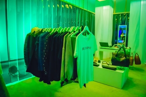
JUST DECORATION 2.0 exhibition
Fine Art

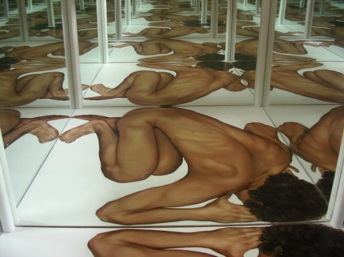
SELFITTING ROOM
Fine Art
Just Decoration exhibition at W Budapest
Fine Art

NEVER HAPPENED exhibition
Fine Art
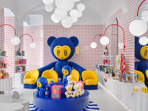
POP BY exhibition
Fine Art
SILA SVETA x HYPERSTUDIO COLLECTIVE x KISSMIKLOS
Fine Art
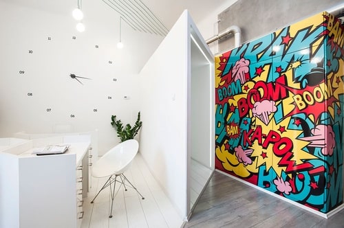
POP&ROLL ART TOILET / ART SHOP / ART GALLERY
Architecture
Design
Fine Art

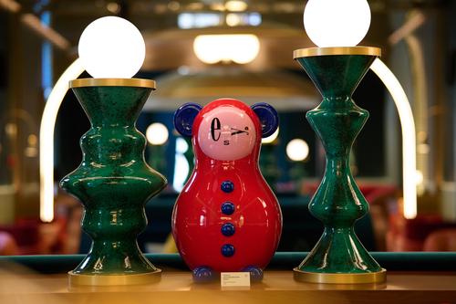
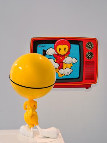
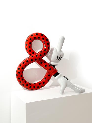
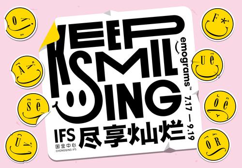
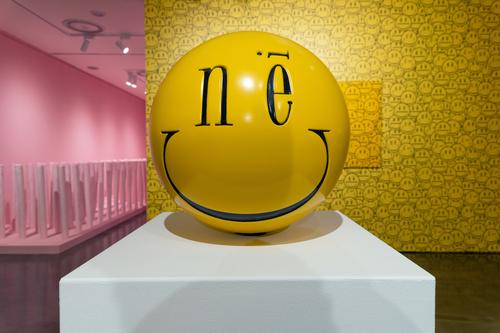
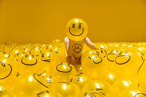
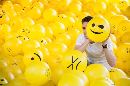
Emograms invasion, Budapest
Fine Art
Kiss Kiss Bang Bang exhibition at E03 Gallery
Fine Art
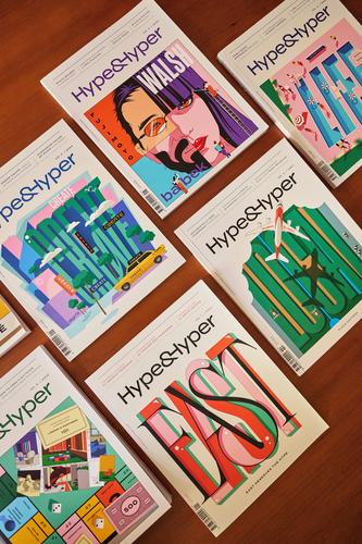
HYPE&HYPER Magazine covers, typography, illustration
Graphic Design
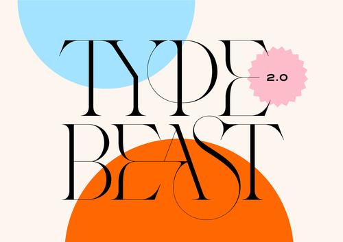
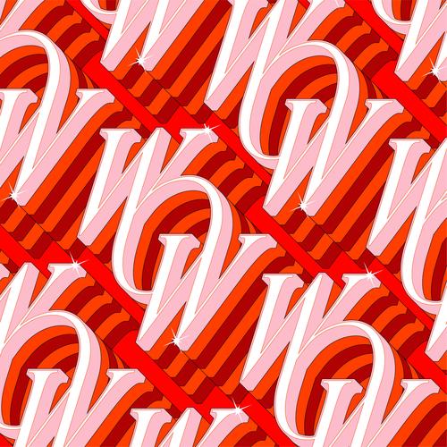
Type Beast 2.0
Graphic Design
Kiss Kiss Bang Bang exhibitions
Fine Art
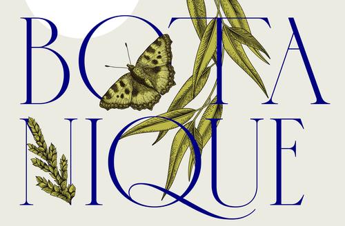
I love typography
Graphic Design
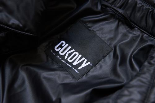
Cukovy rebranding
Graphic Design
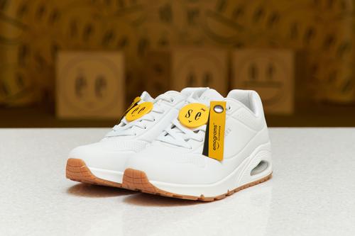
Skechers x emograms by kissmiklos
Fine Art
Chloé typeface
Graphic Design
Emograms exhibitions, shows
Design
Hype&Hyper magazin barnding
Design

The NewSilkRoad branding concept
Design
Veronesi typeface
Graphic Design
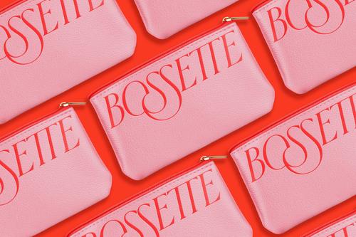
Bossette
Graphic Design
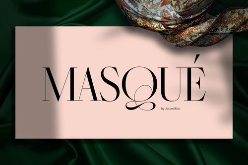
Masqué typeface
Graphic Design
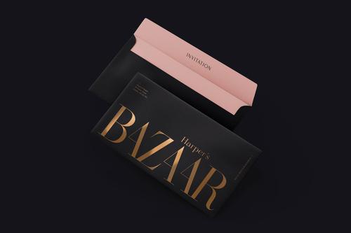
Harper's Bazaar rebranding concept
Graphic Design
52 logos
Graphic Design
emograms x CQIFS, 2020
Design
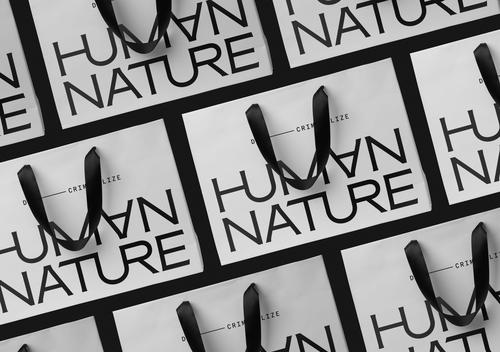
Human Nature rebranding
Graphic Design

LUUX
Graphic Design
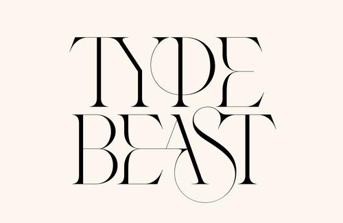
Type Beast
Graphic Design
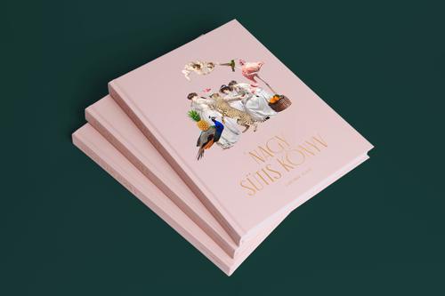
Dessert book
Design
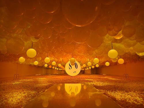
emograms with LOVE exhibition
Fine Art
House of Millennium
Architecture
Design
Kaposvar City Branding
Design
Graphic Design
Ball.Room. - Hello emograms, Gwangju Design Biennale 2019
Fine Art
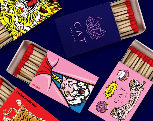
Cat bar and dance club
Architecture
Design
Graphic Design
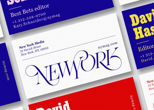
New York Magazine rebranding concept
Design
Graphic Design
Just Decoration serie, prints
Fine Art
Graphic Design
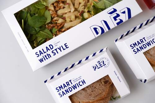
Pléz
Design
Graphic Design
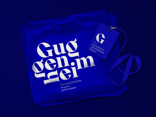
Guggenheim Museums and Foundation rebranding
Design
Graphic Design
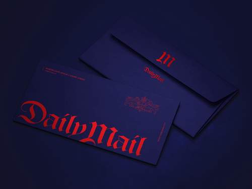
Daily Mail redesign concept
Design
Graphic Design
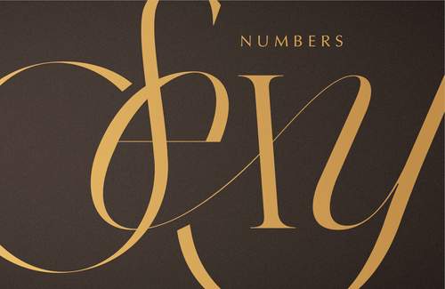
Sexy numbers
Design
Graphic Design
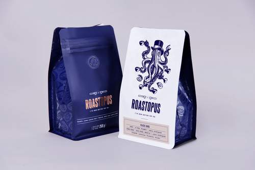
Roastopus Coffee Roastery
Design
Graphic Design
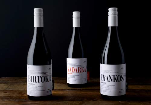
Wine Cellars of Tamás Günzer identity
Design
Graphic Design
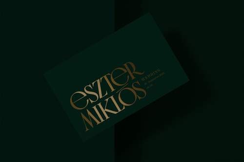
Our wedding identity
Design
Graphic Design
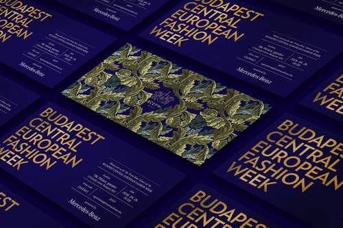
Budapest Central European Fashion Week identity
Design
Graphic Design
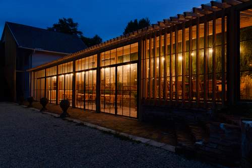
Event hall in Etyek
Architecture
Design
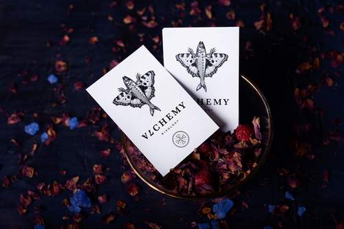
Alchemy Bar
Design
Graphic Design
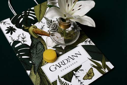
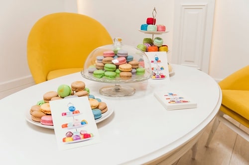
Gard'Ann patisserie
Architecture
Design
Graphic Design
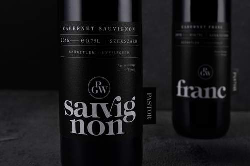
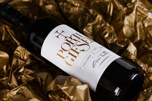
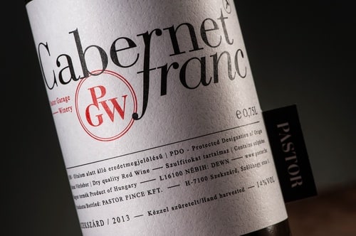
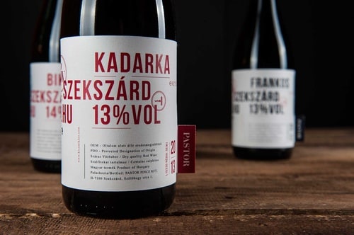
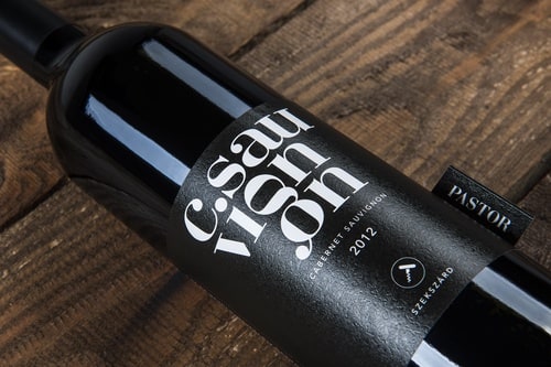
Pastor Winery Selection 2018
Design
Graphic Design
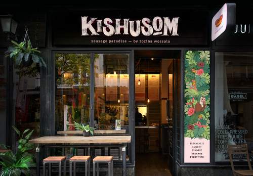
Kishusom
Design
Graphic Design
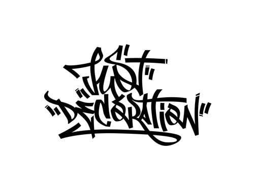
Just Decoration − Graffiti Tag, guerrilla art
Fine Art
Pastor Winery's wines 2017
Design
Graphic Design
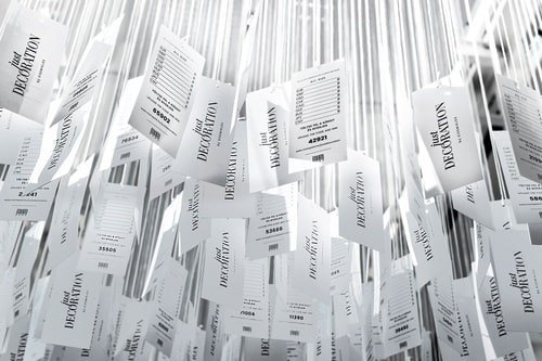
Just Decoration Tag Cloud - MOM Park Shopping Centre
Fine Art
Erzsébet Alehouse
Architecture
Design
Graphic Design
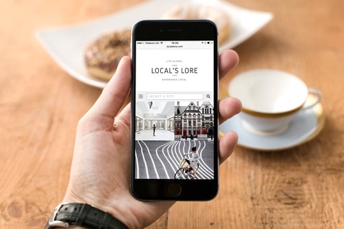
Local's Lore
Design
Graphic Design
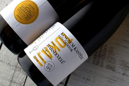
Kincsem Kastély Winery
Design
Graphic Design

Myself — AN INTERACTIVE EXHIBITION
Fine Art

Logotypes 2015-2016
Design
Graphic Design
Wink footwear store
Architecture
Design
Pastor winery's red wines 2016
Design
Graphic Design
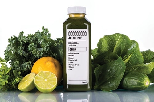
Juiceline
Design
Graphic Design
Ball.Room.
Fine Art
Pastor winery's wines 2016
Design
Graphic Design
Logotypes 2014-2015
Design
Graphic Design
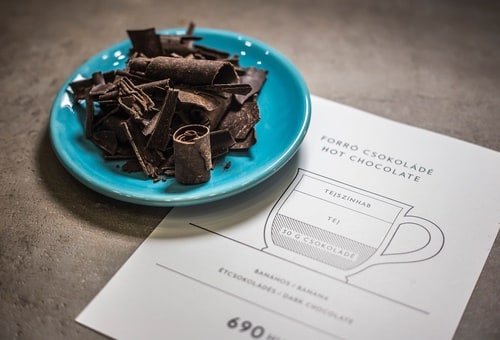
Casca, Chocolate bar and café
Architecture
Design
Graphic Design

Silent Consent
Fine Art
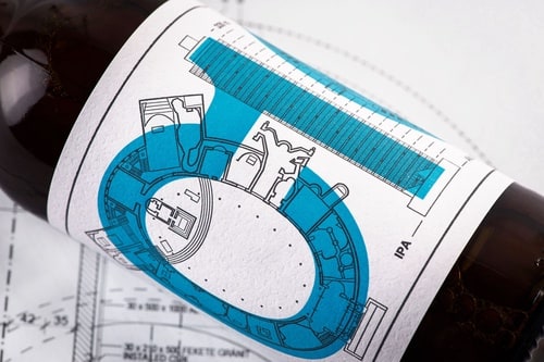
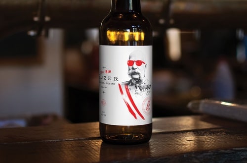
C10, the first 'architect' beer
Architecture
Design
Graphic Design
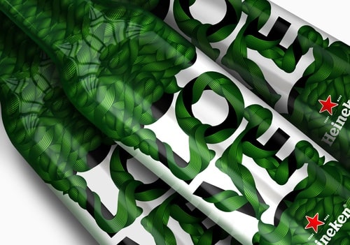
Heineken limited edition
Design
Graphic Design
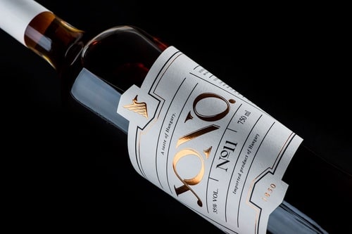
YONO
Design
Graphic Design
The House of the Postmaster
Architecture
Design
Graphic Design
Pastor 2012 Red wines
Design
Graphic Design
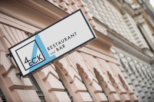
4eck restaurant
Architecture
Design
Graphic Design
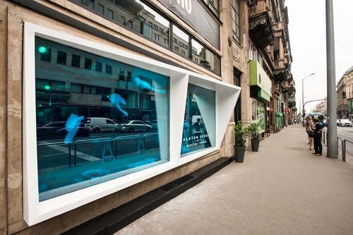
Shopwindow construction for MONO
Architecture
Design
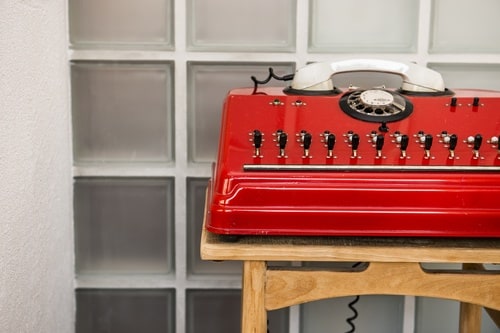
Dekoratio Branding & Design Studio
Architecture
Design
Graphic Design
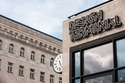
Design Terminal
Design
Graphic Design
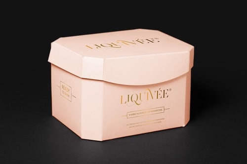
Liquivée
Design
Graphic Design

Buda pálinka
Design
Graphic Design
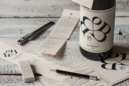
Bernadett Baji's wine label CV
Design
Graphic Design
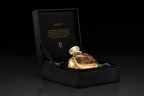
Viktoria Minya / 1st Hungarian perfume line
Design
Graphic Design
Emmaroz
Architecture
Design
Graphic Design
Logotypes 2013-2014
Design
Graphic Design
Heineken Pop up store
Architecture
Design
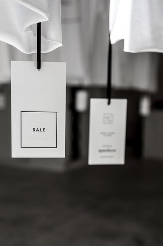
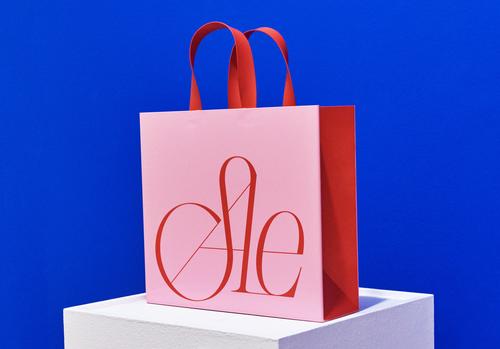
SALE
Fine Art
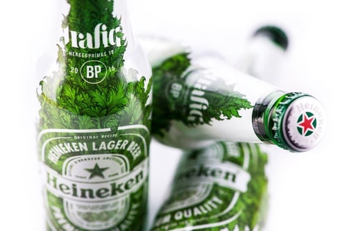
Heineken animation & bottle design for trafiq
Design
Graphic Design
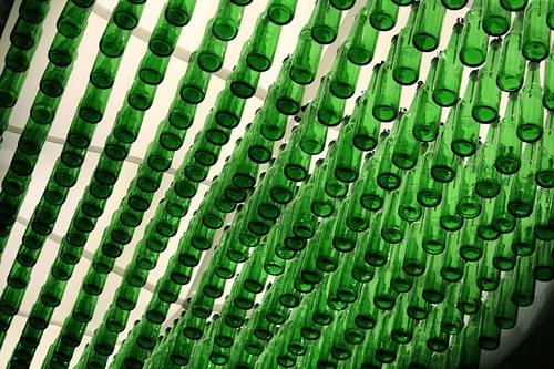
Heinekencloud
Architecture
Design
Logotypes 2012-13
Design
Graphic Design
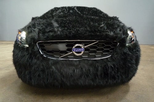
Special Volvo animal edition at the fashion show
Design
Fine Art
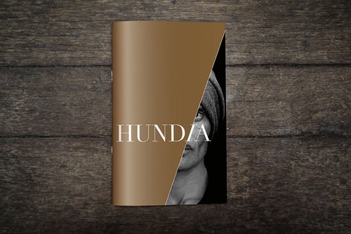
Hundia
Design
Graphic Design
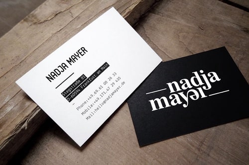
Nadja Mayer
Design
Graphic Design

Heineken Bottle 2013
Design
Graphic Design

Essence
Design
Graphic Design
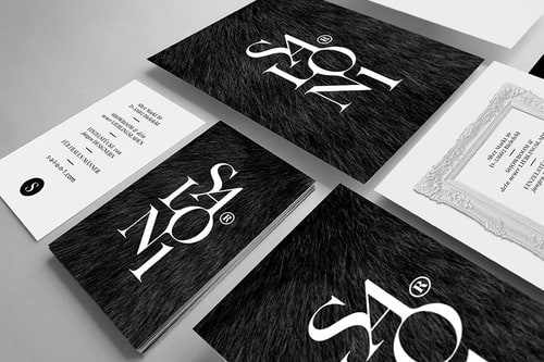
Salon1
Architecture
Design
Graphic Design

Logotypes 2011-12
Design
Graphic Design
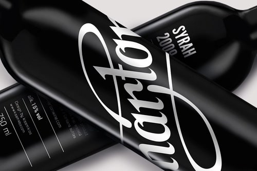
Márton
Design
Graphic Design
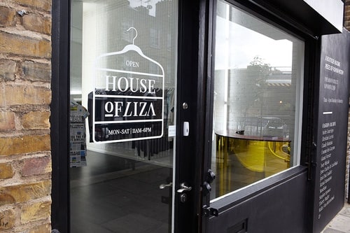
House Of Liza
Design
Graphic Design
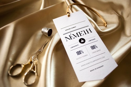
Németh
Design
Graphic Design
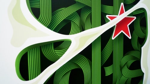
Heineken Bottle
Design
Graphic Design

GOLDENROACH
Fine Art
ANETT HAJDU
Design
Graphic Design
Budapest airport Terminal2 Signage
Design
Graphic Design