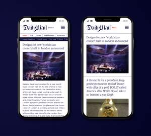
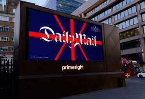
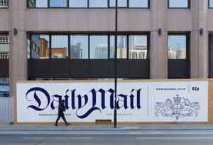
Why does the New York Times or the Guardian look so much more sophisticated than the Daily Mail?
Is there such a big difference in the taste of the audience? Or does tabloid have to be scattered and ugly?
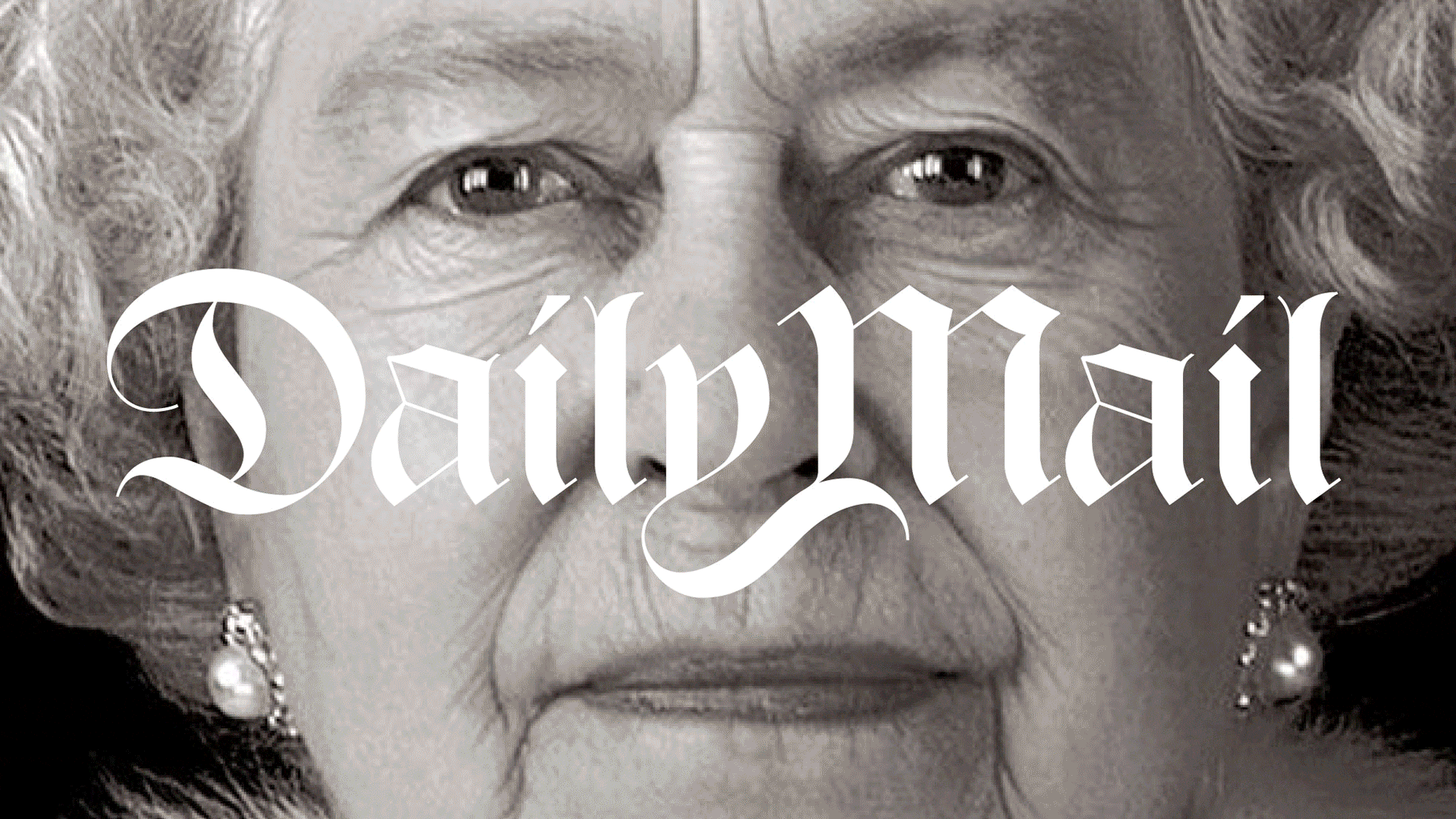
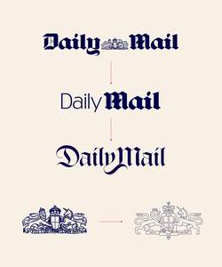
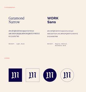
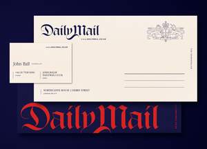
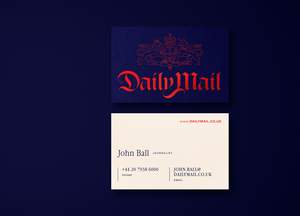
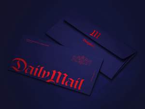
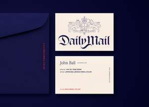
I made an experiment and took one of the most well known tabloid of the world and reimagined it in a more sophisticated and clean way. Taking it back to their origins when they were a serious conservative newspaper.