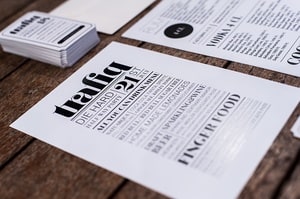
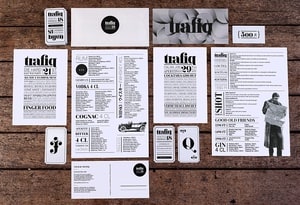
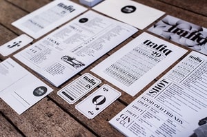
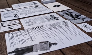
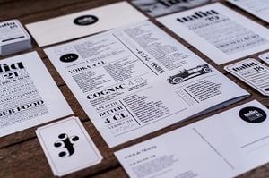
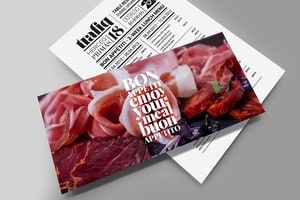
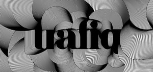
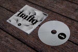
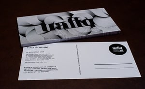
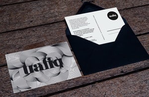
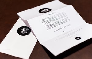
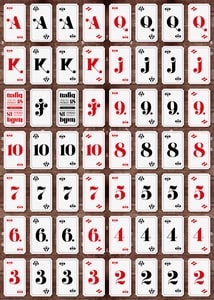
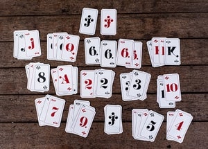
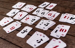
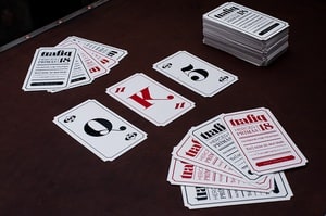
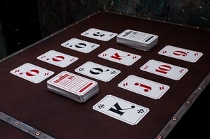
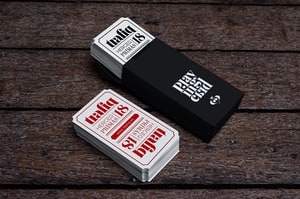
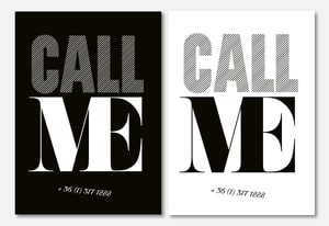
Our goal was to create an image that revives the vibe of the late 19th – early 20th century, while also reinterpreting a vintage style mixed with a modern atmosphere. Therefore, the logo is based on a roman-type font, and is mixed with a playful, classic ligature. The logotype contains the address of the venue. This provides an easier form of communication and unifies the typographic language, moreover, it determines its style. Nevertheless, the typographic language tends to reach beyond the boundaries of a logo and of various graphic elements, and becomes the concept itself, the interior’s distinguishable cornerstone. A “trafik” was a type of tiny shop selling tobacco, sweets, newspapers, toys, and other knickknacks, and was a real treasure island for children. I’ve purposely created an image that conveys this specific atmosphere. The typography resembles of newspaper fonts, french playing cards - the essential accessories of early 20th century clubs and the typical souvenirs of a “trafik”. Trafiq has its own deck of cards, which are being used not only as business cards, but to furthermore strengthen an already well-established visual identity.
“We were looking for a distinguishable visual identity for trafiq, one of the newest bars in downtown budapest. Our goal was to create a bohemian but at the same time sophisticated atmosphere based on the hungarian trafiks of the turn of the previous century. We’ve chosen him based on his portfolio, which we knew would be a perfect match for our concept. Well, we believe that the visual concept is flawless, and reveals itself in the details.” – said István Száraz, founder.
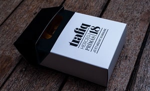
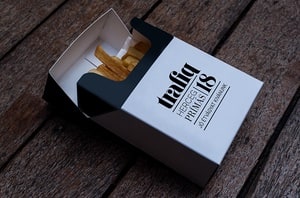
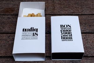
Packaging
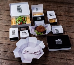
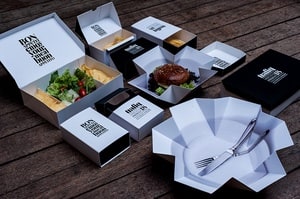
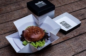
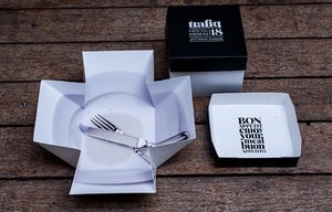
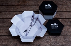
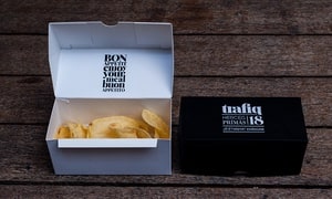
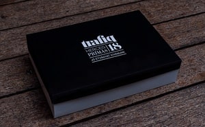
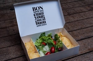
The concept of the packaging is based on the formerly described world of “trafiks”, and puts simple, playful ideas into practice - such as hard-pack cigarette boxes and matchboxes. Regardless, it's still remaining elegant, and follows the visual path carved by trafiq’s image. Both the technological design and the execution of packaging belongs to Sz. Variáns Csomagolástechnikai Kft.
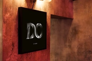
Interior graphics
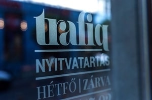
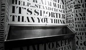
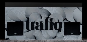
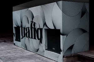
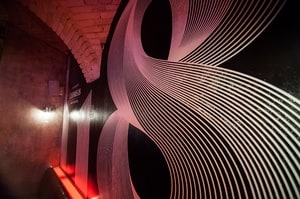
Entrance
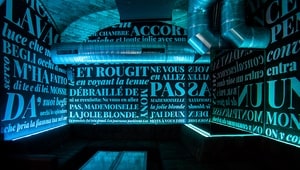
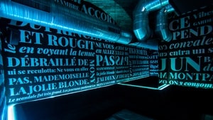
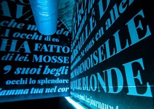
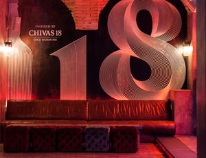
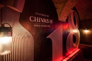
The VIP lounge’s concept:
Similar spaces usually ooze sultry lust, so the quotes written on the walls are taken from erotic literary works in their original languages. The quotes are taken from timeless masterpieces such as Apollinaire’s The Eleven Thousand Rods, Boccaccio’s Decameron, and, last not least, Geoffrey Chaucer’s The Canterbury Tales.
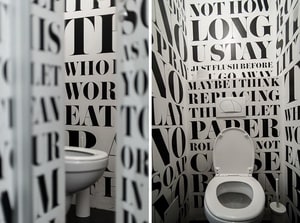
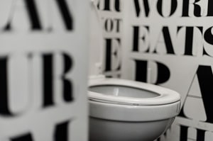
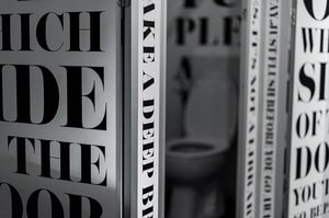
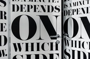
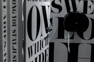
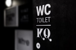
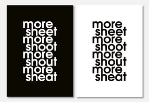
The restrooms’ concept:
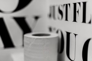
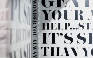
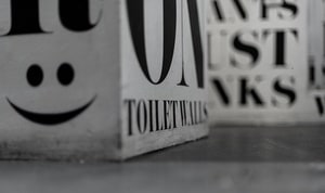
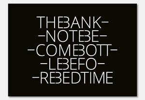
Simplistic restroom graffiti collected from Anglo-Saxon countries, and separated by genders. Their content was not altered, although they are presented in an elegant, footed, and classical antiqua that conjures an intense paradox and basically gives life to an artistic concept; moreover, it gives an iconic edge to its location.
DJ counter
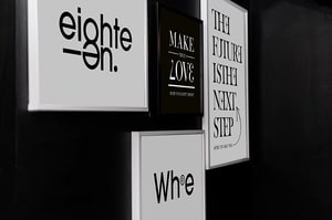
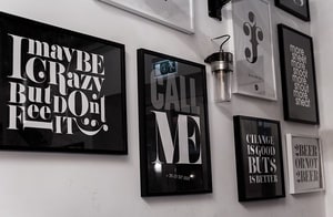
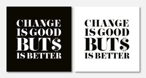
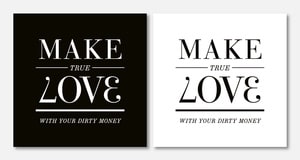
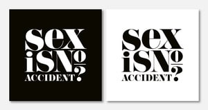
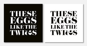
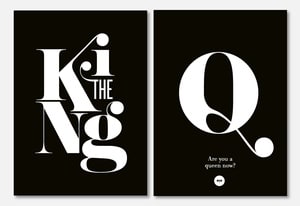
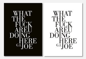
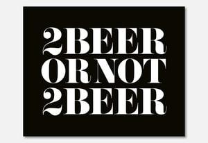
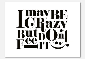
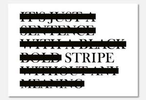
Posters:
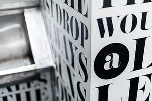
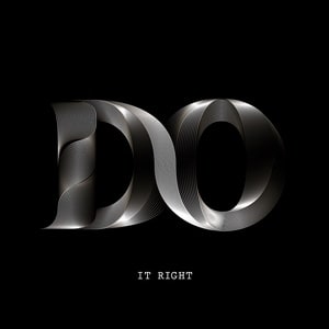
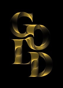
Humorous, framed texts referring to sexuality, night-time entertainment, and getting tipsy, all interpreted in the language of contemporary typography. These texts, at least to an extent, resemble both the philosophy of late 19th – early 20th century artists and the atmosphere of bohemian saloons independent from high-nosed institutions. Classy forms of hidden advertising, signages, and the suggestive art work covering the DJ booth enrich and complement the concepts listed above.