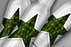
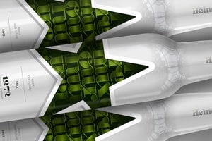
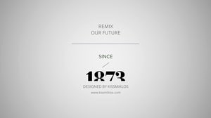
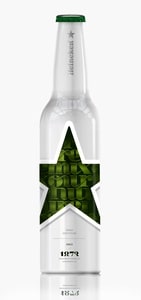
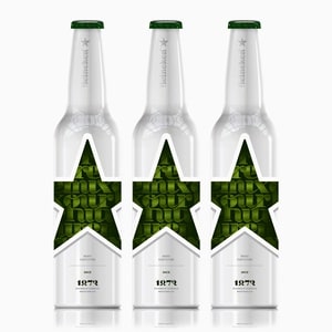
Heineken Bottle 2013


posted in: DesignGraphic Design
tags: best graphic designbest heinekenbest illustrationbest illustration designbest packagebest packagingbest typographycool heinekencool illustrationcool typecool typocool typographydesign bottle kissmiklosdesign illustrationfuture bottlegreen heineken bottleheineken bottleheineken bottle designheineken bottle redesignheineken bottle remixheineken deignheineken design exhibiionheineken illustrationheineken londonheineken typographyheineken ukheineken wamphungarian graphic designhungarian graphic designerillustration packagekissmikloslonodn designlonodn kissmiklosmiklos kissmiklos kiss designmikloskissnice illustrationpackage design. heinken design competitionpackage illustrationpackaging illustrationremix our futuretypographyuk designuk stylewampwamp design fairwamp design vasarwamp heinakanwhite heineken bottlewww.kissmiklos.com