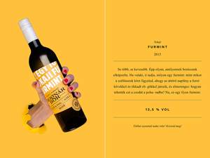
The original name of the winery was Bognár Borbirtok (Winery Estate of the Bognars). When designing the logo I considered the word bor (wine) to be more important, so I placed greater emphasis on it, since the Bognar family (brothers) has several winery estate in different sub-regions of Hungary.
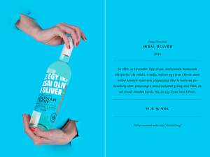
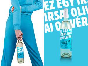
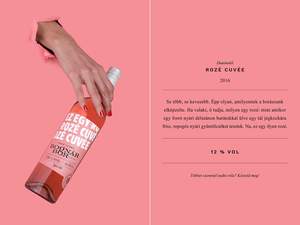
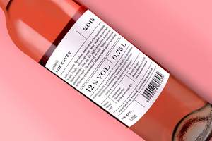
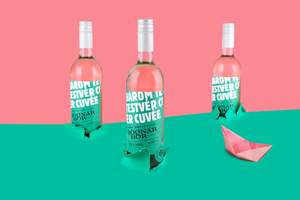
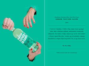
The first set of the winery consisted of cheaper, looser, reductive wines in bottles with screw closure. These features required a youthful design, so I impaired the wines with strong colors.
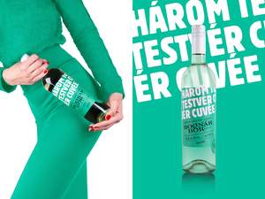
On the front labels I used big white letters to indicate that „This is a … wine.” This sentence continues in the more detailed descriptions on the back labels: „Neither more, nor less… You want to know more? Taste it.”