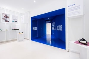
Wink footwear store
Description
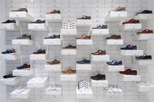
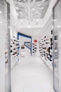
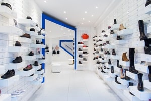
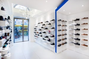
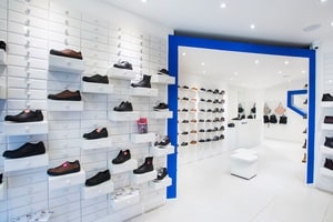
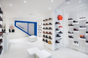
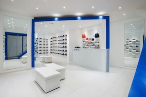
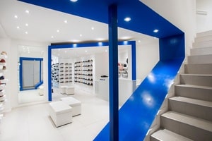
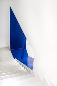
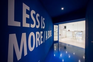
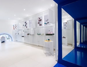
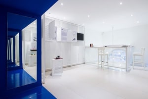
The production of Wink's 2016 autumn/winter collection is carried out by small manufacturers. Instantly, I had a vision from historical museums, stories and descriptions of workshops full of small drawer cabinets. Drawers from white metro tiles. I imagined a space where we mix the memories of old shops with a modern architectural design. As we enter the shop, we are met with an imposing chandelier created from shoe lasts - the most important element of shoe production. From the design aspect this shop was meant to be a flagship prototype for Wink’s new brand image. Wink’s classic white and blue color combinations were retained to generate a continuity in the brand’s history. The white spaces are divided by a series of blue gates, designed in order to lead the customer through the entire shop and upstairs to the design gallery. My main goal was to create a space where the functions go beyond that of a traditional shop - to create an inspiring visual stimulation and an exhibition space that showcases Wink’s renewed brand identity. Area: 90 m2Designkissmiklos
PhotoBálint Jaksa
ClientWink
posted in: ArchitectureDesign
