LACK magazine
Cover photoOrsolya Hajas

Concepts
Some logo and graphic design concepts.


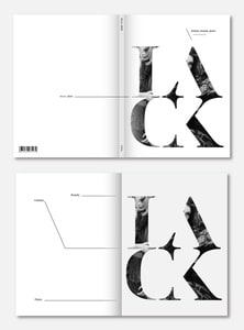
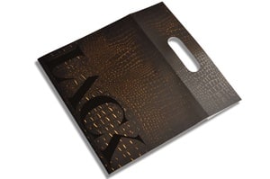
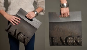
The final logo and design
The magazine cover bag idea and insight design, and typography: I wanted to design a new progressive cover concept. By my opinion, most of the fashion magazines are boring, there’s always a photo and a name on it, but I wanted a more progressive and lively solution. I observed many times how the women hold the magazines in their hands and how often they get in inconvenient situations because they can’t hold the magazines in a more comfortable way. Furthermore, I noticed that moving people potentially represent the best commercial. This was the base of my idea to create a cover which resembles to a handbag. Women walk with it around more easily and it works like a live commercial. I’ve also placed the LACK logo according to this. The cover does not only resemble to a handbag by its shape, but also, every further issue will appear with a cloth sample, so the material would look similar too.
posted in: DesignGraphic Design
tags: Fsahion magazine layoutbeautydivatdivat fotodivat magazindivat magazin cimlapdivat magazin layoutdivat magazin logofashion brandfashion brandingsfashion brandsfashion logofashion magazinefashion magazine coverfashion magazine cover designfashion magazine identityfashion magazine logofashion photokismickloskismicloskiss mikloskissmickloskissmicloskissmikloslondon artslondon designlondon designerslondon fashionlondon fashion weekmiklos kissnew york designnewyork fashionwww.kismiclos.comкиш миклош