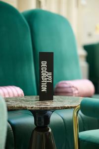
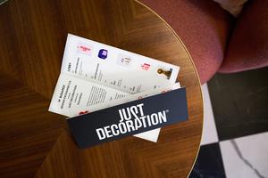
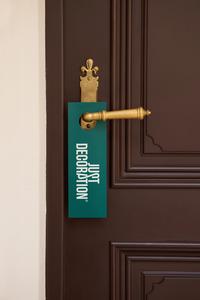
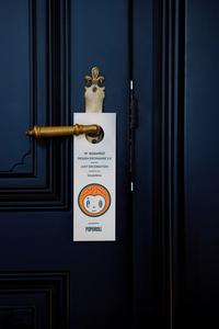
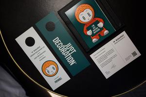
Just Decoration exhibition at W Budapest
JUST DECORATION
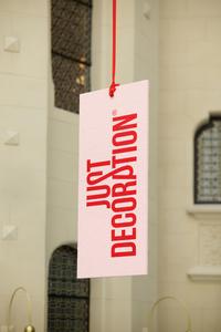
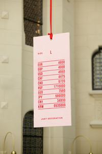
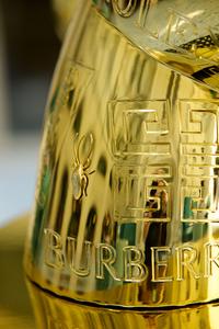
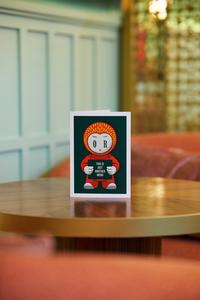
acrylic on extruded plastic 50 x 120 cm A clothing tag as a work of art? One side of this double-sided acrylic painting features a "JUST DECORATION" logo, imitating a real brand tag. The reverse displays the artwork's price in various currencies, just like on an authentic product label. In this case, the product is the label itself. This forces the viewer to confront the monetary value assigned to art, much as they would with a consumer product. The use of multiple currencies subtly hints at global markets and the universal language of commerce. The rougher surface, created with thick paint dots, adds a tactile dimension that contrasts with the smooth, mass-produced feel of a real clothing tag. It highlights the handmade, artistic effort behind the piece, even as it imitates something commercial. This "pop" artwork's texture provides a direct contrast to Byung-Chul Han's "smooth pop" philosophy. The philosopher often uses the concept of "smooth pop" (pleasantly agreeable and straightforward) to critique contemporary consumer culture and the superficiality of art. The "Size L" marking is a subtle irony. It directly copies a commercial standard, but in an artistic context, it suggests a series or a scalable product.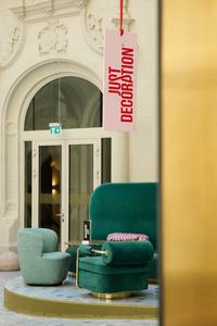
JUST DECORATION
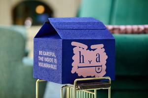
acrylic on paper box 32 x 29 x 33 cm It's a found object, a "readymade" that's been transformed. Using a repurposed delivery box immediately connects the artwork to consumerism, logistics, and the everyday. Cardboard boxes are ephemeral, often discarded. Elevating one to art status forces a re-evaluation of worth. It asks what truly holds value. The thick, hand-painted contrast sharply with the industrial, mass-produced nature of the box. This highlights the artistic intervention and effort, asserting its status as art despite its humble origins. "JUST DECORATION" logo challenging whether it's merely functional packaging or has ascended to art/decoration. The "HAPPY" face is a simplistic, emoji-like representation of emotion, often associated with marketing and superficial positivity. This creates an interesting tension with the vulnerability. "BE CAREFUL, THE INSIDE IS VULNERABLE!". This is the heart of the piece's deeper message. It speaks to the fragility of what's inside, whether it's a physical product, a concept, or even the human psyche. What's inside? Why is it vulnerable? The box itself can be a metaphor for a person or an idea – seemingly plain or utilitarian on the outside, but fragile and complex within. The fact that the viewer can't easily see inside, or determine if it's empty or contains something, is crucial. This ambiguity forces the viewer to engage with the idea of the inside. It plays on consumer expectations of opening a package to reveal its contents, but here the "content" is conceptual. Is there really something vulnerable inside, or is the vulnerability itself the concept?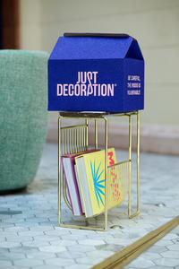
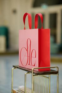
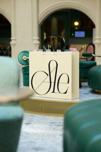
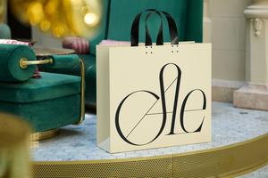
SALE
painted iron 33 x 10 x 33 cm painted iron 83 x 25 x 100 cm The paper shopping bag is ubiquitous in consumer culture and is directly linked to the act of buying, carrying purchases, and the temporary satisfaction of acquisition. "SALE" is a powerful, universal call to action in retail. It implies desire, opportunity, and often, a perceived reduction in value—a striking contrast to the artworks' probable increase in value. Paper bags are meant to be temporary and quickly discarded. Iron, however, is durable. A "SALE" logo (which, in this case, also becomes a brand), typically associated with fleeting deals and planned obsolescence, is here cast in a material meant for timelessness. This is a sharp critique of consumer culture and serves as a memorial to the very concept of the "SALE.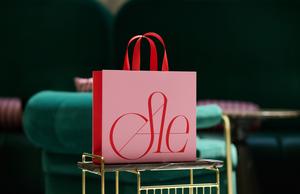
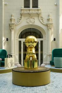
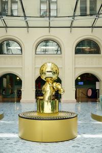
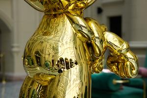
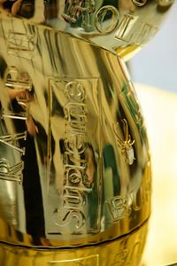
BLING BLING
fibre-reinforced plastic 130 cm "BLING BLING" is a colloquial term associated with ostentatious displays of wealth, materialism, and often, superficiality in popular culture. The shiny gold surface immediately symbolizes wealth, luxury, and desire, but it can also represent excess or superficiality. It suggests that luxury brands aren't just external accessories but have become deeply embedded in one's identity, literally etched onto the self like a tattoo which advertises perceived or real social status. This speaks to the commodification of identity and how consumerism shapes who we are. A key question arises: do these brands own the figure, or does the figure own the brands? The word "HAPPY" on the face suggests a superficial, forced, or expected emotional state. The figure wears "happiness" as a mask, reinforcing the idea that the pursuit of luxury is supposed to bring joy, even if it's an empty promise. The hands are knotted behind the back, symbolizing powerlessness or a lack of agency. The "golden" pedestal further elevates the figure, emphasizing its status as an object of display or veneration. The gold-like surface reinforces the idea that it's being presented as something valuable or aspirational, even as its posture and message hint at deeper issues.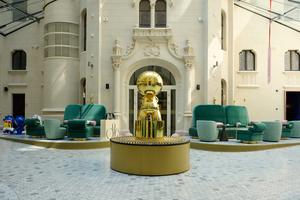
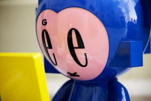
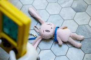
LOST IN PLAY
fibre-reinforced plastic 80 cm lost plush toy 25 cm The "GEEK" sculptures, with their "Tetris" consoles and cubes emerging from their bodies, powerfully and visually convey the addictive and transformative nature of gaming. Immersion in a virtual world literally alters an individual’s physical self. The protruding cubes from their bodies can also be metaphors for digitalization and the blurring of reality. The plush animal on the leash adds a deep and poignant layer to the artwork. This is a found toy from a playground, dirty and burned in several places. Its "wounds" were patched up, and it received a new face with the word "LOST" legible on it. Why is it on a leash? Is this a pet? The "GEEK" figures appear indifferent to the plush animal’s fate. The plush remains "lost," even if it belongs to someone. They no longer play with it, yet it’s still present. Does this serve as a final physical connection between reality and their digital world?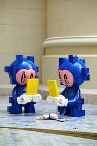
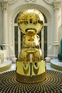
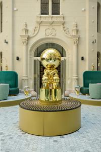
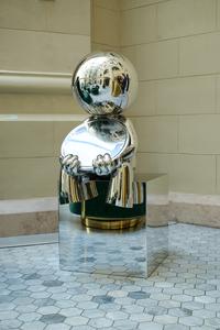
Distortion
fibre-reinforced plastic 70 cm The mirrored surface of the entire figure incorporates the viewer and the environment into the artwork. Viewers see themselves distorted on the figure’s body and the outward-facing mirror held by its hands, prompting questions about self-perception, how we see ourselves versus how others see us, and the fragmented nature of identity in a digital, mirror-obsessed world. André Kertész’s “Distortions” series famously used funhouse mirrors to explore the grotesque, the absurd, and the malleability of the human form and reality. This sculpture directly taps into that legacy, now making the viewer and the environment direct participants, literally incorporating them into the artwork.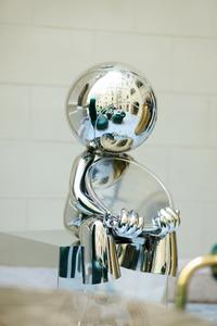

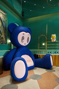
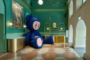
ENJOY
Extruded Polystyrene (XPS), OSB, wooden, plywood, cotton wool, wool felt, leather This is a giant teddy bear with the inscription "ENJOY" on its face and an armchair inside its belly. The artwork is both a functional object and a sculpture, creating childhood nostalgia and an intimate space. The "ENJOY" inscription on its face serves as both a simple invitation to rest and relax and, due to its size and context, has a subtle ironic undertone.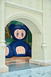
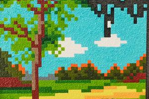
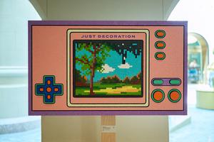
JUST DECORATION
acrylic on extruded plastic 100 x 59 cm This painting on a handheld console depicts a pixelated landscape in the making. The artwork reflects on 17th-century Dutch landscape painting, where artists created an idealized, "perfect" composition rather than depicting reality. The machine also does not create a real landscape, but only an essence of what programmers have "taught" it. The landscape created by the machine is not yet fully completed; the pixels are still moving downwards to their predetermined spots, just like in a game of Tetris. The inscription "JUST DECORATION", as the name of the console, carries a playful irony. It doesn't specify whether it critiques the landscape created by the console, or the entire artwork itself, which may later be degraded into a decorative object.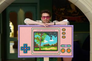
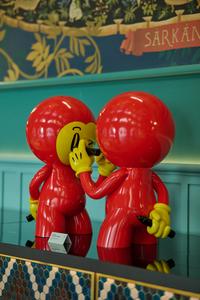
IMITATION GAME
fibre-reinforced plastic 60 cm The figures are identical, and they are drawing the word "COPY" on each other’s faces. This creates a self-referential loop. Are they copying each other, or copying the act of copying? It’s a continuous, potentially futile, cycle of replication. The other hand holding a pen behind their backs implies a hidden agenda. It prompts questions like: How much of our own identity is formed by imitating others? Consider the constant dialogue between influence, homage, and originality in art: where does inspiration end and imitation begin? The title, "IMITATION GAME," directly references Alan Turing’s concept of the "Imitation Game" (what we now call the Turing Test), which explores whether a machine can "imitate" human intelligence so perfectly that it’s indistinguishable from a human. It also reflects on the pervasive nature of trends, memes, and viral content where ideas are endlessly copied and re-shared, sometimes losing their original meaning.
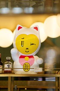
Supposed to do...
fibre-reinforced plastic 80 cm The Maneki Neko is traditionally a symbol of luck and prosperity. The inscriptions "LUCKY" on its face and "GOOD LUCK" on its belly reinforce this meaning. Today, this symbol is often obsolete, found in many shops and households as a decorative element, without any real content. What does the title "SUPPOSED TO DO..." refer to? What is this cat supposed to do? Bring luck? Become a work of art? Be a decorative object?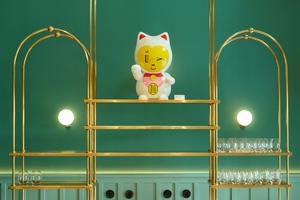
Change my mind
fibre-reinforced plastic 80 cm This sculpture tackles critical themes pertinent to contemporary society, highlighting the central tension between a desire for openness and the inherent difficulty of overcoming ingrained prejudice and domineering attitudes. It prompts questions like: Is true dialogue possible when extreme views are present? How do we engage with ideas such as "bigotry" or "authoritarianism"? The clown-like figure, often associated with humor, artifice, and hidden emotions, juggles various heads. Its own head bears the word "OPEN." This is a precarious act, prompting reflection on how long this "open" perspective can be maintained. While the heads appear balanced now, this equilibrium can shift at any moment, because with every new juggling act, another head could take the place of his own.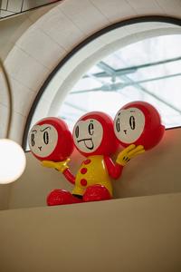
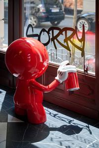
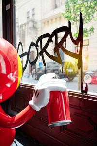
Arty Farty
fibre-reinforced plastic 80 cm The word 'REBEL' is visible on the face of the graffitiing figure, which is spraying the word 'SORRY' onto the gallery window from the inside. The figure is simultaneously rebellious ('REBEL' and graffiti) while also showing remorse ('SORRY'). Combined with the title, is it a strongly sarcastic work hidden behind a facade of cuteness, or a pretentious, empty piece of affected artistry?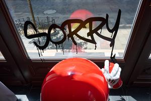
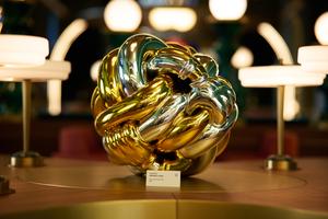
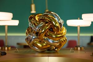
Infinity Hug
fibre-reinforced plastic 50 cm Knots inherently represent connection, entanglement, complexity, and sometimes permanence or unbreakable bonds. The sculpture is inspired by the Gordian Knot. This symbolized an insolvable problem, which Alexander the Great "solved" by violently cutting it. Conceived as an unbreakable knot of embrace, the sculpture directly contrasts this, positioning "INFINITY HUG" as a counter-narrative to destructive solutions. The sculpture is formally a perfect decorative element and design object too.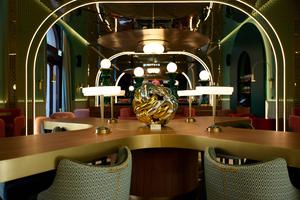
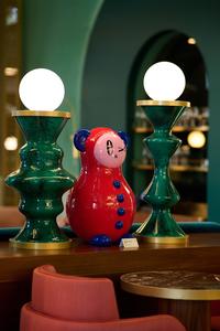
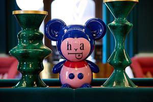
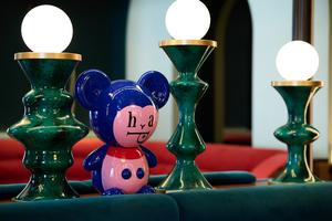
Just Decoration (Easy) and Just Decoration (Happy)
fibre-reinforced plastic 60 cm fibre-reinforced plastic 61 cm These two sculptures, appearing as "cute," "childlike," or even "doll-like" decorative objects, resemble porcelain figures. They are the embodiment of "just decoration" and the perfect representation of "smooth pop." Their childlike appearance might evoke nostalgia. "HAPPY" suggests a mandatory or superficial joy, while "EASY" implies a lack of complexity, effort, or challenge. Together, these words can represent the curated, often simplified, and perpetually "positive" facade of modern life, especially as portrayed in consumer culture and social media. Everything is supposed to be "happy" and "easy." Their approachable, "cute" aesthetics act as a Trojan horse to the deeper, more critical works of art in the exhibition.
JUST A SMOOTH POP
- cocktail of the exhibition Byung-Chul Han often uses "smooth pop" to critique contemporary consumer culture and the superficiality of art. This aligns perfectly with the "JUST DECORATION" exhibition's questions about the blurred lines between art and decoration. In this context, the cocktail itself becomes an embodiment of "smooth pop"—easy to consume and enjoyable, yet it subtly hints at deeper ideas. Lobby art is often criticized for being too smooth, too decorative, and losing its edge, much like Han's interpretation of "smooth pop." So, the cocktail's name serves as a playful commentary and a self-ironic nod to the exhibition's central theme. The "Just a..." beginning reinforces the playful and self-deprecating nature of the "JUST DECORATION" title, as if to say, "Oh, it's just a simple cocktail, but still..."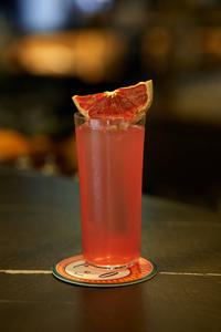
posted in: Fine Art