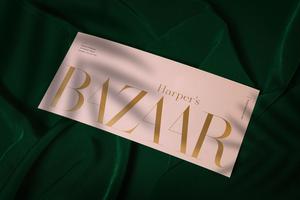
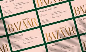
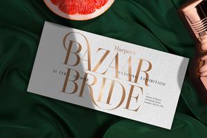
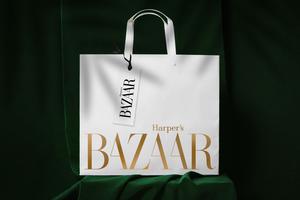
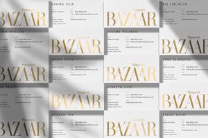
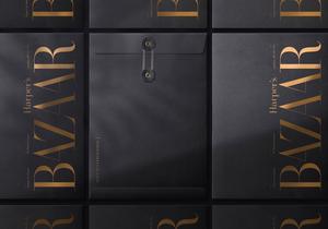
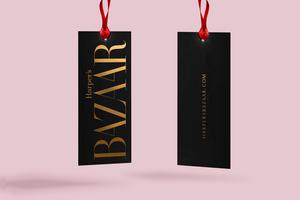
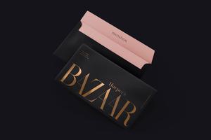
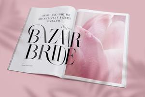
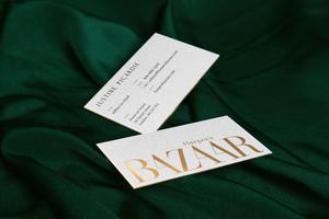
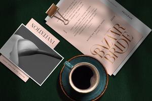
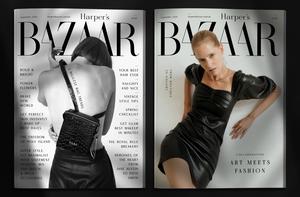
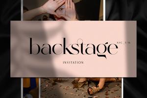
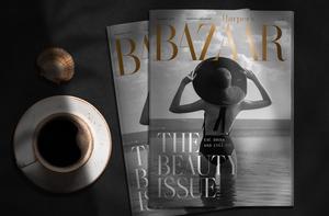
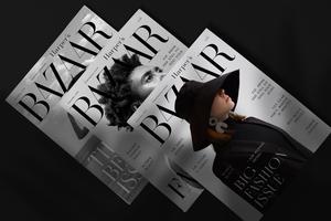
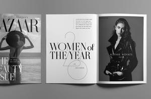
Harper's Bazaar is an American monthly women's fashion magazine, based in New York City, first published on November 2, 1867. When I was studying at the Academy of Fine Arts, I found some very old Harper’s Bazaars in the library. I really liked flipping through them. Sitting in a hotel room in 2019, I started sketching while checking the Korean Harper’s Bazaar. Suddenly the sketches came together into a logo. I decided to redesign the magazine’s basic identity. While playing with this rebranding I designed a new typeface.
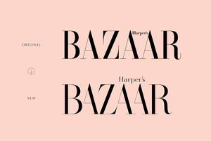
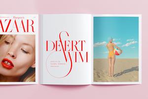
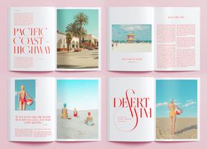
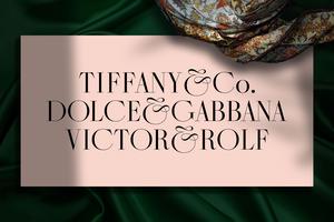
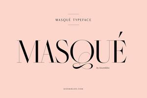
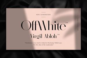
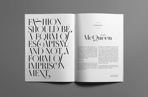
This typeface is inspired by the marvelous and historical Didot font. Masqué is a hairline typeface, it looks best in bigger sizes, useful for headlines, titles, or shorter texts. You find many alternates to several letters.